It’s been three years since we moved into our 114-year-old home. It’s been such a pleasure to be its current guardians as we honor the house’s history while customizing the décor to our tastes. Taste and style differ by individual and can evolve. For those, like me, who enjoy customizing their home’s décor, that can mean an ongoing quest to surround yourself with items that help you feel at home and capture your stylistic vision. In my journey through traditional design, I’ve learned more about the elements of this style that speak to me.
Many of my favorite decorative components are hallmarks of the traditional style, such as:
- Embracing historically relevant design elements of 18th and 19th Century Europe,
- using wood-finished antique furniture,
- placing accessories and furniture in pairs (symmetry),
- incorporating classic architectural motifs including wall and ceiling moulding and built-in shelving and drawers,
- collecting original paintings of landscapes and still life,
- using lush textiles such as silks and velvet for pillows, window treatments and upholstery and decorative trims,
- showcasing traditional patterns of damask, paisley toile, florals, and other organic prints
- coordinating colors within a room,
- styling with grand and antique accessories,
- placing Oriental-style rugs, and
- creating a feeling of distinguished comfort, control, precision, everything in its expected place.
Other traditional decorative elements express my interests and inclinations more specifically. They include a love of :
- Ornate decorative wooden scrollwork and textural plaster reliefs,
- handmade items and a deep appreciation of the exquisite craftsmanship of historical, lasting furniture pieces,
- natural materials such as live plants, wood, marble, and other stones,
- organic imagery in fabrics, paintings, reliefs, wallcoverings,
- woven tapestries,
- classic urn and arch shapes,
- all shades green and red, and
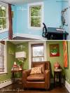
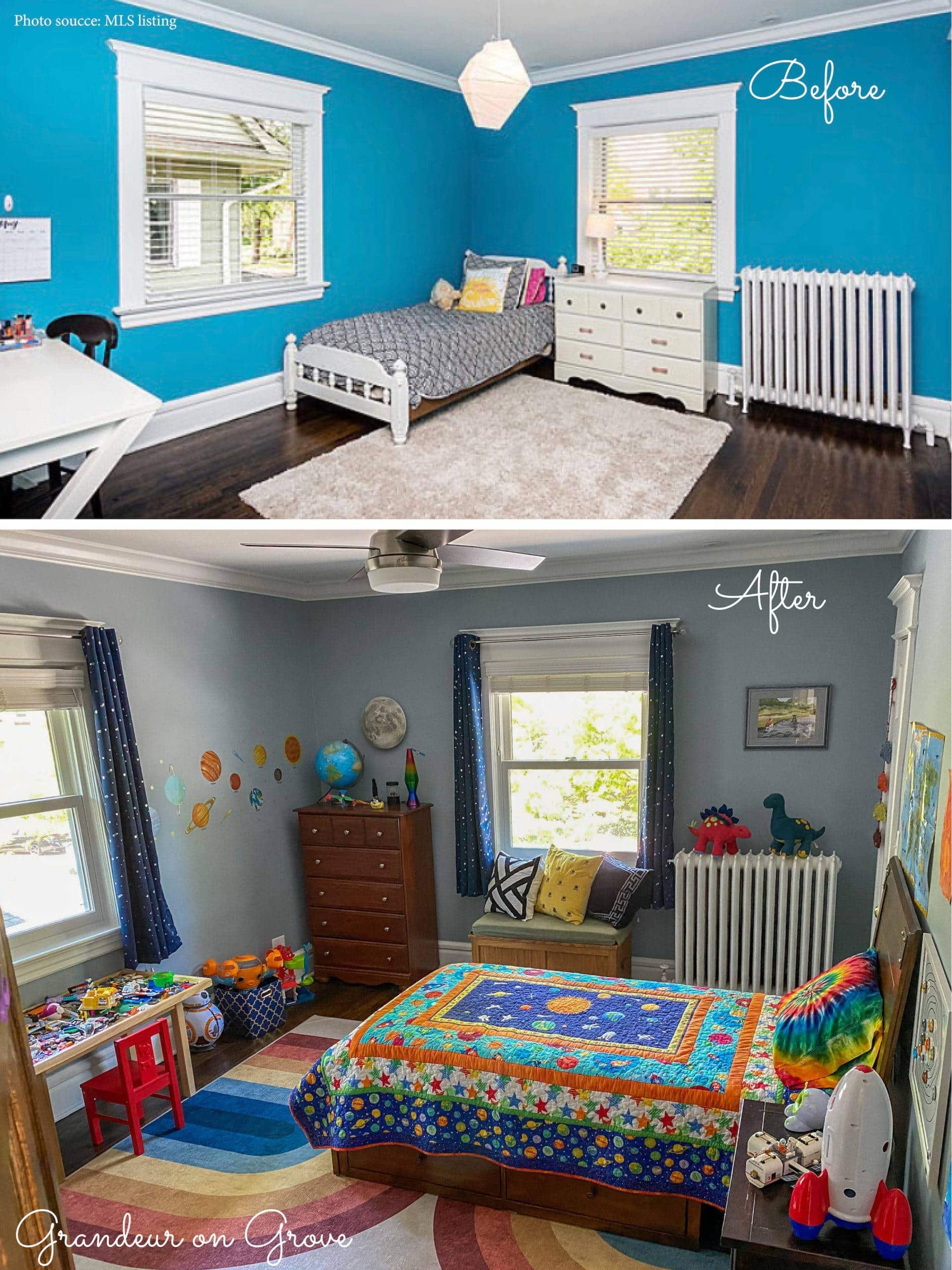
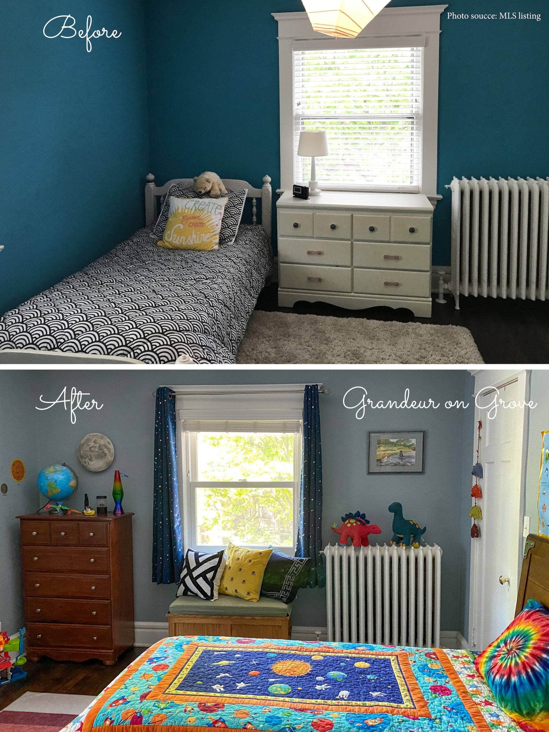
- occasional pops of color (see this child’s bedroom, attic playroom, and office/guest room).
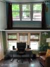
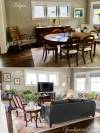
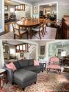
You may have previously seen some of these photos as part of Grandeur on Grove’s room portfolios, but the before pictures are all new to help you see the customizations. I wanted to share some of the images from right before we moved in, not to provide “look-at-this-derelict-room-transformed-anew” type of before and after photos, but rather to first glimpse the house as it was presented to us. Then, you will see how I used traditional design principles and my preferences to style this home for my family.
Formal living room
View more “After” photos in the Formal Living Room portfolio.
![]()
Office/guest room
View more “After” photos in the Office/Guest Room portfolio.
Family room
We changed the former dining space into a family room. View more “After” photos in the Family Room portfolio.
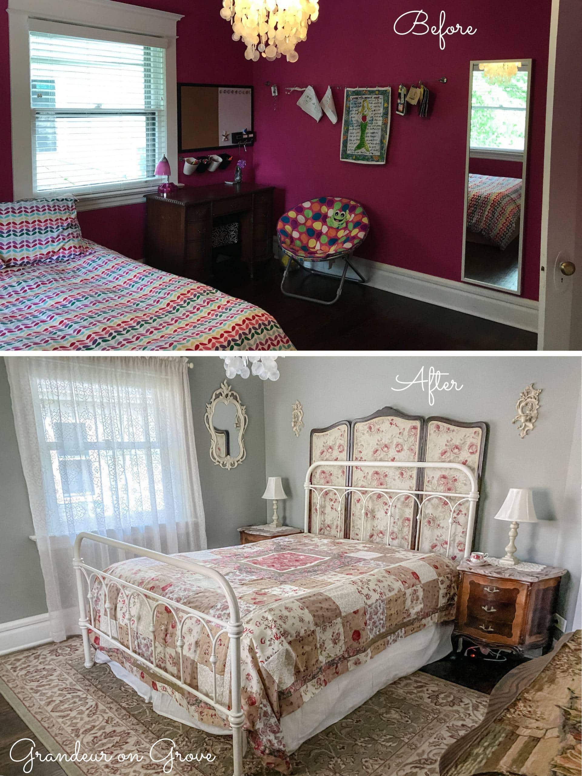
Child’s bedroom
View more “After” photos in the Child’s Bedroom portfolio.
French guest room
View more “After” photos in the French Guest Bedroom portfolio.
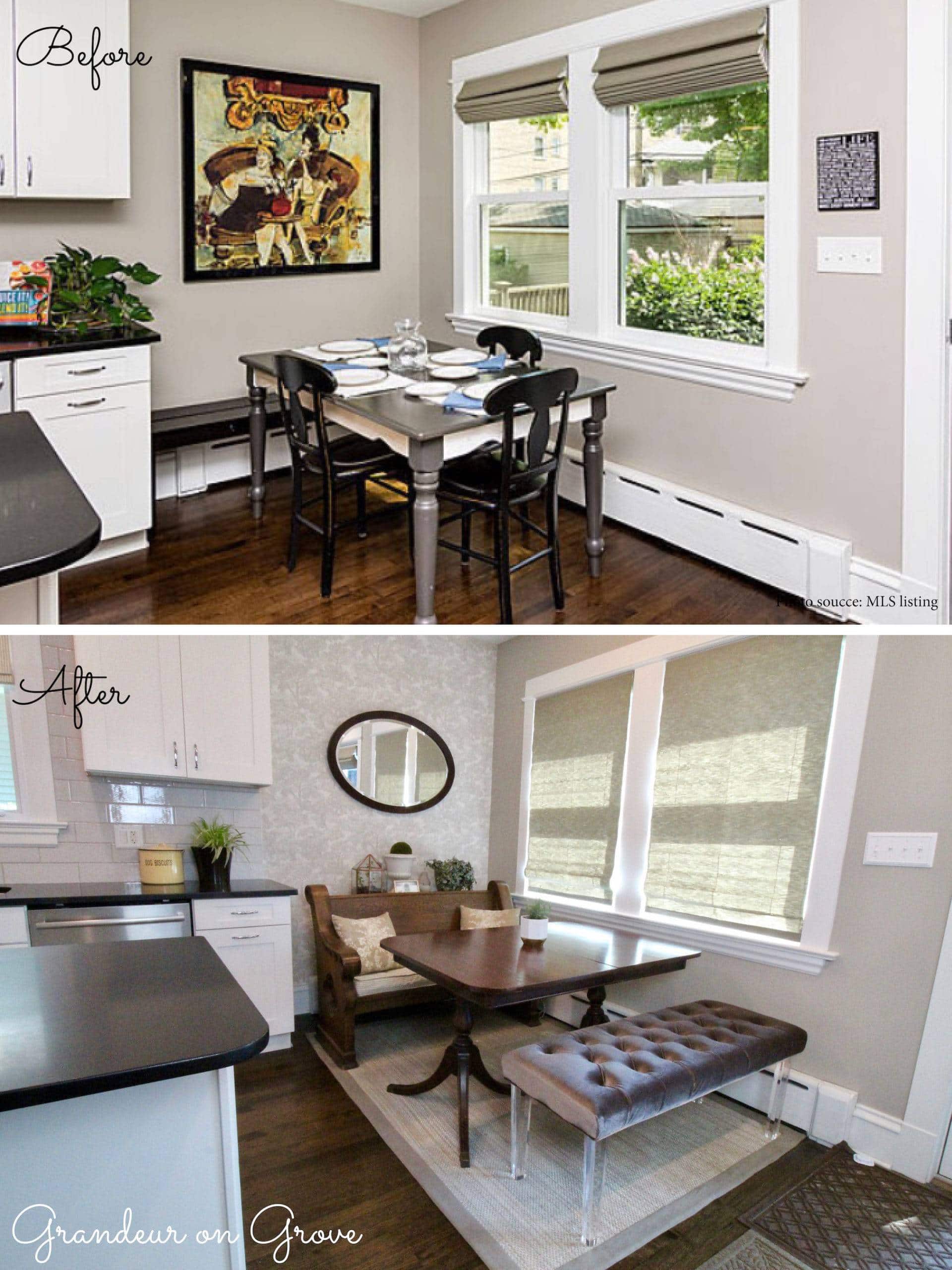
Kitchen nook
View more “After” photos in the Kitchen & Breakfast Nook portfolio.
Attic playroom
View more “After” photos in the Attic Playroom portfolio.
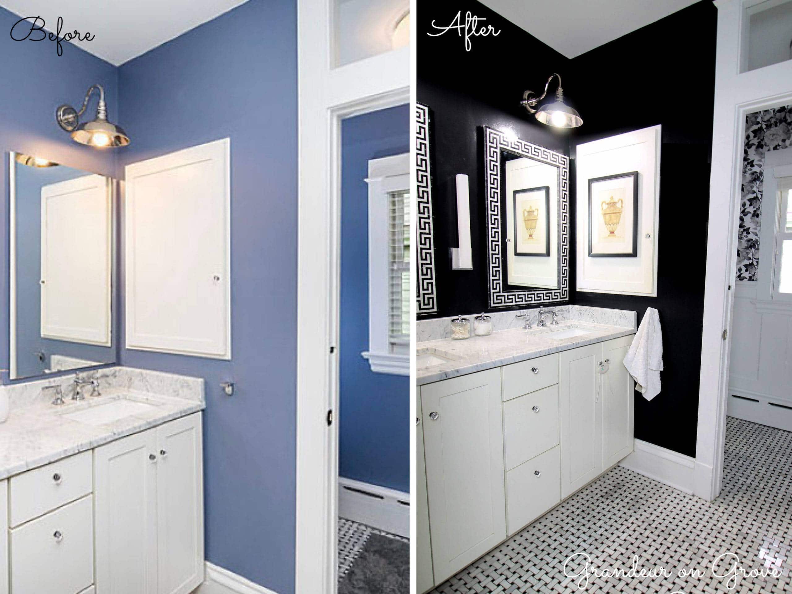
Bathroom
View more “After” photos in the Bathroom portfolio and read the bathroom’s transformation article.
Transition space–a stair landing
View more “After” photos in the Transition Spaces portfolio.
![]()
Primary bedroom
View more “After” photos in the Primary Bedroom portfolio.
![]()
Attic landing
![]()


